Glassmorphism in CSS: How to Create the Frosted Glass UI Effect with Backdrop-Filter
Learn how to build modern glassmorphism in CSS using backdrop-filter, semi-transparent RGBA backgrounds, borders, and shadows with accessible contrast fallbacks.

Over the past several design generations, user interface aesthetics have oscillated between extreme skeuomorphism—with its heavy leather textures, glossy bevels, and simulated drop shadows—and stark flat minimalism, which eliminated all visual depth in favor of solid color blocks. In recent years, modern interface design has settled into a sophisticated middle ground known as Glassmorphism. Characterized by translucent panels, optical background blurs, subtle border highlights, and floating multi-layered depth, glassmorphism has become a defining aesthetic across Apple's macOS and iOS, Microsoft's Fluent Design System (Acrylic material), and modern web applications.
While the visual effect resembles high-end frosted glass, implementing glassmorphism cleanly in CSS requires an understanding of how modern browser rendering engines composite layers. Done correctly, it produces breathtaking, tactile UI cards, navigation bars, and modal overlays. Done carelessly, it can degrade rendering performance, create illegible text that fails accessibility standards, or break entirely on older browsers. In this comprehensive guide, we will unpack the four essential CSS pillars of glassmorphism, dissect the crucial difference between filter and backdrop-filter, provide production-ready code examples with accessible fallbacks, and demonstrate how to design custom glass components instantly using the CoditTools Glassmorphism Generator.
The Four Visual Pillars of Glassmorphism
The term "Glassmorphism" was originally coined by UI designer Michal Malewicz to describe an interface style defined by optical transparency and frosted glass realism. To successfully execute this aesthetic in web design, your CSS component must coordinate four distinct design layers:

- Optical Translucency: The element must not use an opaque background color. Instead, it utilizes semi-transparent color definitions via
rgba()orhsla(), allowing light and color from underlying shapes to penetrate the surface. - Backdrop Defocus (Frosted Blur): Real frosted glass scatters incoming light rays, blurring whatever sits directly behind it. In CSS, this optical dispersion is accomplished via
backdrop-filter: blur(...). - Subtle Refractive Border: Because real glass panels have physical cut edges that catch ambient light, adding a delicate 1px border with a slightly higher white opacity provides crisp structural definition and separates the card from busy backgrounds.
- Multi-Planar Depth & Ambient Shadows: Glass cards must feel as though they float gracefully above the canvas. A soft, diffuse box shadow provides gentle elevation without looking muddy.
Backdrop-Filter vs Filter: The Critical Architectural Distinction
When web developers first attempt to create a frosted glass effect, the most common catastrophic mistake is applying standard filter: blur() to the container element:
/* THE INCORRECT APPROACH: DO NOT DO THIS */
.broken-glass-card {
  background: rgba(255, 255, 255, 0.2);
  filter: blur(10px); /* Catastrophic error! */
}
In CSS, the standard filter property applies graphical alterations to the element and all of its child DOM nodes. If you apply filter: blur(10px) to a card, the card's headings, paragraphs, buttons, and icons will all be rendered completely unreadable. Furthermore, filter has zero effect on elements positioned underneath the card.
The modern, proper property is backdrop-filter. The backdrop-filter property instructs the browser rendering engine to apply graphical effects exclusively to the pixels behind the element, before painting the element's own background, borders, and children:
/* THE CORRECT PRODUCTION APPROACH */
.glass-card {
  background: rgba(255, 255, 255, 0.2);
  backdrop-filter: blur(16px);
  -webkit-backdrop-filter: blur(16px); /* Required for Safari & iOS */
}
With backdrop-filter, whatever colorful photos, geometric shapes, or animated gradients sit behind the card are smoothly defocused, while your text, icons, and interactive buttons remain razor-sharp in the foreground.
Production-Ready Glassmorphism: Complete Code Example
Here is a complete, self-contained HTML and CSS implementation of a modern glassmorphic card component featuring all four pillars, smooth rounded corners, and subtle hover interaction:
/* HTML Structure:
<div class="glass-container">
  <div class="glass-card">
    <h3>Premium Membership</h3>
    <p>Experience next-generation user interface design with frosted aesthetics.</p>
    <button class="glass-btn">Get Started</button>
  </div>
</div>
*/

/* 1. Underlying Vibrant Background (Required for blur visibility) */
.glass-container {
  display: flex;
  justify-content: center;
  align-items: center;
  min-height: 400px;
  background: linear-gradient(135deg, #4f46e5 0%, #06b6d4 50%, #ec4899 100%);
  padding: 32px;
}

/* 2. Glassmorphic Card Styling */
.glass-card {
  max-width: 420px;
  padding: 32px;
  border-radius: 16px;
  color: #ffffff;

  /* Translucent Surface */
  background: rgba(255, 255, 255, 0.15);

  /* Frosted Optical Blur (Always include -webkit- prefix) */
  backdrop-filter: blur(14px);
  -webkit-backdrop-filter: blur(14px);

  /* Glass Edge Reflection */
  border: 1px solid rgba(255, 255, 255, 0.3);

  /* Ambient Floating Elevation */
  box-shadow: 0 8px 32px 0 rgba(0, 0, 0, 0.2);

  /* Smooth Hover Transition */
  transition: transform 0.2s ease, box-shadow 0.2s ease, border-color 0.2s ease;
}

.glass-card:hover {
  transform: translateY(-4px);
  box-shadow: 0 12px 40px 0 rgba(0, 0, 0, 0.28);
  border-color: rgba(255, 255, 255, 0.45);
}

.glass-card h3 {
  margin-top: 0;
  font-size: 1.5rem;
  font-weight: 700;
  letter-spacing: -0.02em;
}

.glass-card p {
  color: rgba(255, 255, 255, 0.9);
  line-height: 1.6;
}

.glass-btn {
  background: rgba(255, 255, 255, 0.25);
  color: #ffffff;
  border: 1px solid rgba(255, 255, 255, 0.5);
  padding: 10px 20px;
  border-radius: 8px;
  font-weight: 600;
  cursor: pointer;
  backdrop-filter: blur(8px);
  -webkit-backdrop-filter: blur(8px);
  transition: background 0.2s;
}

.glass-btn:hover {
  background: rgba(255, 255, 255, 0.4);
}
Browser Support, Vendor Prefixes, and Progressive Enhancement
While backdrop-filter is supported across all modern versions of Google Chrome, Microsoft Edge, Mozilla Firefox, and Apple Safari, there are two crucial technical caveats that frontend developers must account for in production environments:

1. Mandatory WebKit Prefix for Safari
WebKit engines (powering Safari on macOS and all web browsers across iOS and iPadOS due to Apple engine policies) require the -webkit-backdrop-filter prefix. Omitting this prefix means your card will render as a completely flat, non-blurred transparent box on iPhones and iPads.
2. Feature Queries for Graceful Degradation
If a client is using an older legacy browser, has disabled hardware acceleration, or is using an operating system with high-contrast accessibility modes enabled, backdrop-filter may fail to render. Without blur, an ultra-translucent 15% opacity card against a busy patterned background will cause text to collide with underlying shapes, rendering your content illegible.
To prevent this, employ progressive enhancement with the CSS @supports rule:
/* 1. Base Fallback: Solid, high-opacity background for unsupported clients */
.glass-card {
  background: rgba(15, 23, 42, 0.92); /* Opaque slate background ensures 100% legibility */
  border: 1px solid rgba(255, 255, 255, 0.15);
  box-shadow: 0 4px 20px rgba(0, 0, 0, 0.2);
}

/* 2. Modern Enhancement: Applied only when the browser supports backdrop blur */
@supports (backdrop-filter: blur(10px)) or (-webkit-backdrop-filter: blur(10px)) {
  .glass-card {
    background: rgba(255, 255, 255, 0.16);
    backdrop-filter: blur(14px);
    -webkit-backdrop-filter: blur(14px);
    border: 1px solid rgba(255, 255, 255, 0.3);
  }
}
Accessibility and WCAG Contrast Compliance
The single greatest hazard of glassmorphism is failing accessibility audits. Under WCAG 2.1 AA standards, regular body text requires a minimum contrast ratio of 4.5:1 against its background, and large text (18pt or 14pt bold) requires at least 3:1.
Because a glassmorphic element is translucent, its effective background is a composite of its own tinted surface and whatever moves beneath it. If your card floats over an image carousel, a video background, or an animated gradient, the contrast ratio will continuously fluctuate. To safeguard accessibility:
- Avoid Ultra-Low Opacities: While 5% white opacity looks ethereal on a static designer mockup, it offers near-zero optical isolation. Keep your surface background opacity between 15% and 30% for dark backgrounds, or between 60% and 80% for light backgrounds.
- Amplify Blur Radius: A higher blur radius (between 12px and 24px) homogenizes underlying image noise, turning sharp background details into smooth color gradients that are far easier to read against.
- Use Solid Text Colors with Drop Shadows: Avoid translucent text colors inside a translucent card. Use pure
#fffffffor dark mode glass or#0f172afor light mode glass. Adding a subtle text shadow (e.g.text-shadow: 0 1px 2px rgba(0,0,0,0.3);) dramatically enhances letter edge recognition. - Test with Reduced Motion & Transparency: Respect users who have toggled OS-level accessibility settings like
prefers-reduced-transparencyby providing high-opacity alternatives via CSS media queries.
Generating Custom Glass CSS with CoditTools
Tweaking the delicate balance between blur radius, background opacity, border shine, and shadow elevation through manual code edits can be time-consuming. To streamline your UI design workflow, use the CoditTools Glassmorphism Generator.
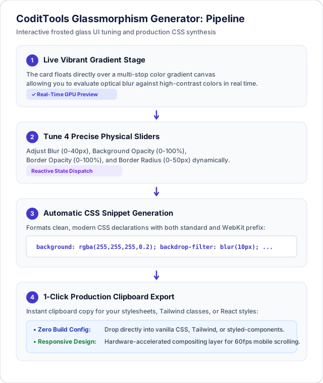
What You Can Customize in the CoditTools Generator:
- Backdrop Blur Slider (0px to 40px): Dial in the exact optical dispersion required for your UI depth.
- Background Opacity (0% to 100%): Calibrate surface translucency to balance frosted styling against text contrast.
- Border Opacity & Thickness: Adjust edge reflection intensity to give your cards sharp physical presence.
- Border Radius (0px to 50px): Shape your components from subtle rounded corners to pill-shaped glass badges.
- One-Click CSS Export: Automatically outputs standards-compliant CSS including
-webkit-backdrop-filterprefixes ready to paste into React, Vue, Svelte, or vanilla CSS stylesheets.
Performance Considerations: GPU Compositing and Paint Costs
Backdrop filters are computationally demanding operations. When a browser encounters backdrop-filter, it must copy the rendered contents of the underlying frame buffer into an off-screen texture, execute a multi-pass Gaussian blur on the GPU, and composite the blurred texture back into the viewport before painting the element. To keep your application running at 60 or 120 FPS:
- Do Not Over-Nest Blurred Containers: Avoid placing a glass modal inside a glass drawer that sits over a glass navigation bar. Stacking multiple active blur layers causes GPU fill-rate bottlenecks, especially on mobile devices.
- Be Cautious During High-Frequency Scrolling: If an extensive page contains dozens of glassmorphic cards in a fast-scrolling feed, the GPU must continuously re-blur the viewport on every frame. Consider restricting glassmorphism to fixed header bars, sticky action docks, or modal overlays.
- Promote to a Dedicated Compositing Layer: You can inform the browser to optimize rendering of your glass element by adding
will-change: transform;ortransform: translateZ(0);during active animations.
Frequently Asked Questions About Glassmorphism in CSS
Why does my glassmorphic card look flat and grey?
Glassmorphism relies entirely on optical refraction of whatever sits behind it. If your card is placed over a solid flat white or grey background, there are no color transitions or shapes to blur, making the card look like a dull flat box. To make glassmorphism pop, place your elements over colorful gradients, high-resolution photography, or geometric background shapes.
Can I create dark mode glassmorphism?
Yes. For dark mode glassmorphism (often referred to as "dark glass"), replace white translucent backgrounds with dark semi-transparent tones such as background: rgba(15, 23, 42, 0.65);. Use a subtle dark border highlight (e.g. border: 1px solid rgba(255, 255, 255, 0.1);) and pair with light text.
Does backdrop-filter work inside SVG elements?
Direct SVG support for backdrop-filter via CSS is limited across browsers. For SVG vector graphics, developers typically use native SVG filter primitives like <feGaussianBlur> and <feColorMatrix> inside a <filter> definition rather than CSS backdrop-filter.
How does glassmorphism differ from neumorphism?
Neumorphism (soft UI) relies on extruded solid plastic surfaces created using dual contrasting drop shadows (one light, one dark) on identical background colors, without any transparency. Glassmorphism, by contrast, relies on transparency, optical blur, and multi-plane depth over colorful backgrounds.
Summary and Next Steps
Glassmorphism brings depth, tactile realism, and visual elegance to modern web applications. By mastering the synergy of rgba() background opacity, vendor-prefixed backdrop-filter: blur(), crisp 1px borders, and accessible contrast fallbacks, you can craft interfaces that feel premium and modern across all devices.
Ready to design your next glassmorphic UI card or navigation bar? Visit the free CoditTools Glassmorphism Generator to experiment with live visual sliders and copy production-ready CSS instantly. For related styling tools, explore our Box Shadow Generator, Color Converter, and our complete collection of CSS Tools.
Try the tools mentioned in this post - all free, no account needed.
Runs in your browser. No watermarks. No file uploads to a server.
Browse CSS generators & tools →